ZALORA | B2C | Conversion Rate Optimisation | summary
Increasing conversions through seamless UX
Redesign checkout journey
to ensure a seamless and transparent user experience, achieving a significant reduction in checkout abandonment rates while driving higher customer satisfaction and hence conversion rate
"I want maximum discount with minimal effort"
The Challenge
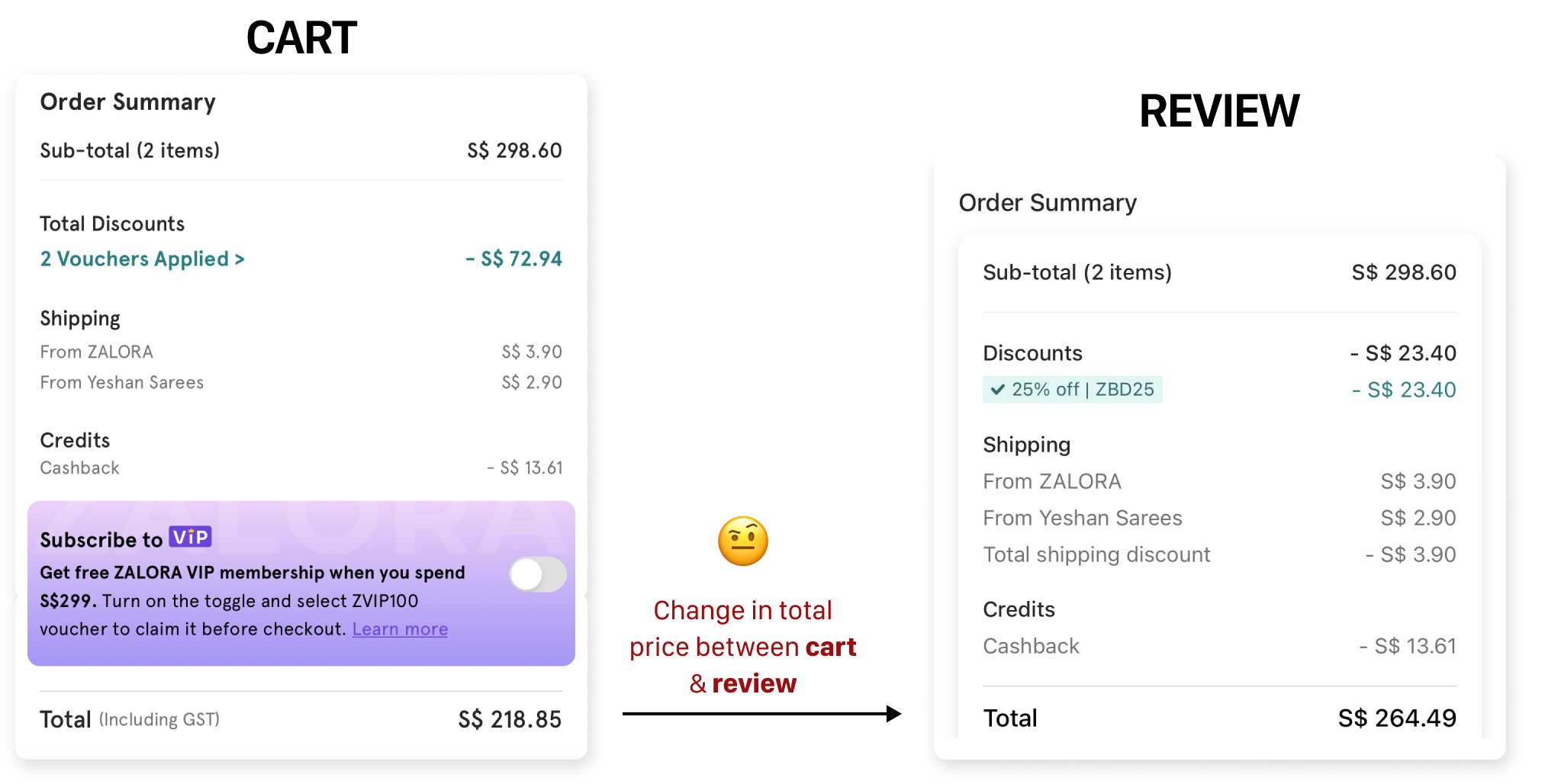
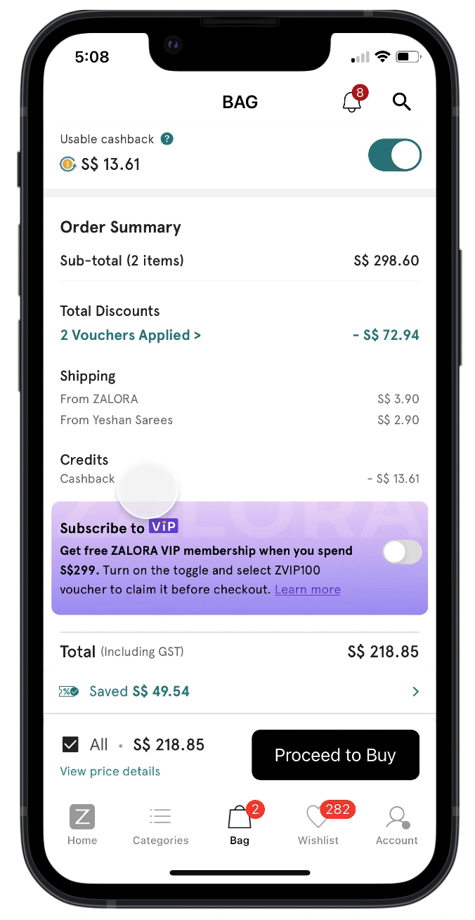
Zalora’s checkout experience was redesigned a year ago, yet conversion rates (CR) had started dipping. Users faced friction with:•Unclear discount applications – Many didn’t realize which vouchers applied or why some were removed.•Inconsistent pricing – The total amount often changed between cart and checkout, leading to drop-offs.•Lack of transparency in payment method discounts – Users weren’t aware of savings available through alternative payment options.💡 How might we make the checkout experience intuitive and effortless while driving business impact?
The Solution
We focused on clarity, efficiency, and trust to ensure users could complete their purchases smoothly. Key UX optimizations included:→ Enhanced discount visibility: Clear separation of item-level vs. payment vouchers on cart to reduce confusion. Item level vouchers are auto-applied whereas payment vouchers are not.→ Contextual payment guidance: Clear messaging on payment step using tags like S$xx.xx Saved, Last Used, etc. along with discount amount on each payment method to help users make smarter payment choices and maximize savings.→ Real-time pricing updates: Payment step dynamically adjusted totals based on selected payment methods.→ Reducing FOMO: Instead of showing textfield to enter discount code on review step, applied payment voucher discount is shown. Bottom modal shown on tap.
The Impact
In the A/B test conducted on launch, the new design showed following results:↑ 6.4% increase in conversion rates.
↓ 8.2% reduction in checkout abandonment.
↓ 36% reduction in checkout completion timeA Smarter, Smoother Checkout: These refinements empowered users with clarity and confidence while shopping—turning what was once a confusing process into a seamless experience.
Want the Full Story?
If you’re curious to explore the full journey behind this optimization—how we uncovered pain points, iterated through design solutions, and leveraged research to drive measurable impact—dive into the complete case study.Click the button below to see detailed insights, design iterations, and the strategy that shaped this seamless checkout experience. 🚀